
Why do you need alternative texts at all?
All figures that show relevant content - for example logos, symbols, photographs, diagrams or formulas - need an alternative text. This requirement is obvious: when you can not see the figure, it should "speak" to you - and preferably something which is meaningful.
Which rules should I consider?
-
I can see what you can not see
The basic rule about creating alternative texts is: what would you tell another person on the phone to communicate the content of the figure. -
Either-Or
As its name says: an alternative text is thought as an alternative to the figure and not an addition. It should describe the quintessence of the figure and need not to be a detailed description. -
Two is not better than one
Please avoid to use an available caption as an alternative text - this is saying the same thing twice over. A caption is perceptible for everyone and adds something to the figure - an alternative text in contrast replaces the figure. Double naming is at least annoying or even confusing. -
Without foreplay
Omit introducing words like "The picture shows ..." and come to business. -
Text=Text
If a figure contains text, than the alternative text should pick up exact this text. In case of the logo of a company this could be the company name and corresponding slogan. -
Summarizing is allowed
It is often difficult to write alternative texts for figures like bar charts, pie charts, coordinate systems or curve charts without writing half a novel. Instead try to get the trend of a chart to the point.
By the way: when the data of a diagram is already mentioned in the text then it is enough to write "SBar chart about topic xyz" as alternative text. -
Brevity is the soul of wit
As rule of thumb: not longer than a text message (that means only 160 characters!).
Good to know: on average a braille-line has about 80 characters.
But in case of data diagrams you can break this rule sometimes.
Some examples
Example 1
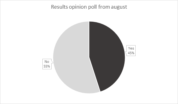
Alternative text:
"Pie chart with the results of the opinion poll from august: 45% Yes | 55% No"
Example 2
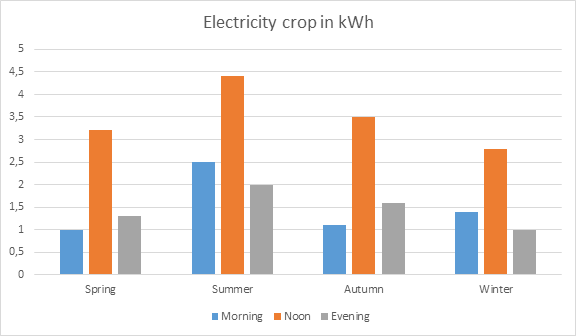
Alternative text:
"Bar chart: Electricity crop in spring, summer, autumn and winter; values from the mornings, noons and evenings respectively. The values in the noons are always the highest; peak value is in summer."
Example 3

Alternative text:
"Screenshot: Word dialog box "Modify Style" with the settings of "Heading 1"."